
WHAT YOU'LL FIND ON THIS PAGE
Displacement
The crisis itself: who was pushed out, where it happened, why it happened, and who gets hurt
Housing Costs
Economic pressure driving displacement: cost burden, price appreciation, and affordability gaps
Demographics
Who lives here: income inequality, wealth gaps, and demographic patterns across Atlanta
Neighborhoods
Granular data by location: top 20 neighborhoods, quadrant breakdowns, and detailed tables
Take Action
Convert understanding into action: ways you can help save Black Atlanta
A SHOWROOM, NOT A SANCTUARY
Marketing Black Success While Normalizing Black Inequality
MYTH
The 'Black Mecca' Myth
The narrative that Atlanta is a place where all can reliably achieve economic, social, and political advancement.
REALITY
#1
in Income Inequality in the U.S.
Behind the "Black Mecca" narrative lies stark economic disparity. Black Atlantans face systematic barriers to wealth building, homeownership, and economic mobility.
Income Gap:
(3x disparity)
Wealth Gap:
Poverty Rate:
"A Black Mecca that steadily exports its historic communities is not a place of prosperity; it's a poverty pipeline."
CRISIS AT A GLANCE
29,746
Black residents lost (2000-2010)
#4
Nationally for gentrification eliminating Black areas
65%
of Black renters are cost-burdened
42%
of majority-Black neighborhoods lost that status by 2010
INTERACTIVE DISPLACEMENT MAP
Explore the 7 priority neighborhoods experiencing the highest appreciation and displacement across Atlanta on our interactive map.
View the Map on The Crisis PageDISPLACED BY DESIGN
A Nationwide Pattern with Local Severity
THE GENTRIFICATION TRIGGER
Population Boom Sparked Crisis
Atlanta lost 100,000 residents between 1970 and 1990. The 2000s population boom brought new residents with higher incomes, sparking property appreciation and displacement that accelerated through the 2010s and 2020s.
The Perfect Storm
The explosive growth of the 2010s created the perfect storm for gentrification: increased demand, rising property values, and economic pressure that pushed out long-time Black residents.
BLACK POPULATION DECLINE
Black Population Percentage Over Time
<50%
Black population fell below 50% in 2020 for the first time since 1960
THE SCALE OF DISPLACEMENT
Atlanta ranks 4th nationally for gentrification eliminating majority-Black areas
(National Community Reinvestment Coalition, 2019)
22,149
Black residents displaced from 16 majority-Black tracts (1980-2020)
42%
of majority-Black tracts lost that status by 2010
29,746
Black residents lost (2000-2010)
This is not accidental - it's the result of deliberate policy choices
💡 WHAT THIS MEANS
Over 22,000 Black residents have been pushed out of historically Black neighborhoods in the past 40 years. Without TAD extensions funding affordable housing and anti-displacement programs, this trend will accelerate, erasing the cultural and economic foundation of Black Atlanta.
WHAT THIS DATA TELLS US
The displacement data reveals three interconnected patterns that demand immediate policy action.
DISPLACEMENT IS ACCELERATING
The rate of Black population loss increased from 2.9% per decade (1990s) to 5.7% per decade (2010s). Without intervention, projections show the Black population could fall below 40% by 2035.
GEOGRAPHY IS SHIFTING
Gentrification has moved from the Northeast (already transformed) to the Southwest and Northwest quadrants. The neighborhoods most at risk today are the last remaining majority-Black areas in the city.
WEALTH GAP IS WIDENING
Black homeowners hold only 17% of housing wealth despite being 47% of the population. Rising prices benefit existing property owners while pricing out renters and first-time buyers.
For the full picture of what these trends mean for Atlanta's communities, see:
What's At Stake on The Crisis PageHISTORICAL CONTEXT
Atlanta Population Trends (1970-2025)
Atlanta Total Population Timeline
- 1970497KPEAK
- 1990394K-21%
- 2000416K+5.7%
- 2010539K+29.3%
- 2020499K-7.4%
- 2025 (est)543K+1.7%
DEMOGRAPHIC TRANSFORMATION
No Longer a Majority-Black City
| RACE/ETHNICITY | 2000 | 2020 | 2025 (EST) | CHANGE |
|---|---|---|---|---|
| Black | 61.4% | 46.7% | 46.9% | -14.5 pts |
| White | 31.3% | 38.5% | 38.8% | +7.5 pts |
| Hispanic | 4.5% | 6.0% | 6.8% | +2.3 pts |
| Asian | 1.9% | 4.5% | 5.2% | +3.3 pts |
The Impact: By 2020, Atlanta reached demographic parity, ending its decades-long status as a Black-majority city.
HOUSING WEALTH INEQUALITY
17.4%
of housing wealth held by Black households despite being 47% of population
$220K
lower average home values for Black homeowners
100K+
unit affordable housing shortage in Atlanta
Additional Housing Crisis Facts
- 12+percentage point homeownership gap
Black households fall 12+ points below city average in homeownership rates
- 50%+of renters are cost-burdened
More than half of renters spend over 30% of income on housing, with Black renters facing the highest burden
💡 WHAT THIS MEANS
Black families hold only 17% of housing wealth despite being nearly half the population. The $220K home value gap means Black homeowners have less equity to pass to future generations. TAD extensions can fund down payment assistance, affordable housing development, and homeownership programs to close this gap.
🔄 Connect the dots
Return to the Displacement tab to see how these demographic shifts connect to population loss and neighborhood change
DISPLACEMENT BY QUADRANT
Neighborhood-Level Analysis of Gentrification Patterns
Demographic Changes by Quadrant
NORTHWEST
INTENSIFYINGWHITE GROWTH
+3.7%
BLACK DECLINE
-11.8%
Key Displacement Zones:
English Avenue: +1040% price growth, +21.3% White, -14.6% Black
Grove Park: +721% price growth, +11.4% White, -9.6% Black
Bankhead: +315% appreciation, +13.9% White, -11.5% Black
NORTHEAST
GENTRIFIEDWHITE GROWTH
+25.7%
BLACK DECLINE
-53.1%
Transformation Complete:
Old Fourth Ward, Inman Park: Fully transformed
Reynoldstown: +213% appreciation, +331% recent growth
SOUTHWEST
EPICENTERWHITE GROWTH
+15.4%
BLACK DECLINE
-23.0%
Primary Displacement Frontier:
Mozley Park: +464% appreciation, leads all neighborhoods
West End: +16.2% White, -15.4% Black, +429% growth
12 of top 20 gentrifying tracts are in Southwest
SOUTHEAST
ACCELERATINGWHITE GROWTH
+20.4%
BLACK DECLINE
-22.0%
Rapid Frontier Shift:
Capitol View: +276% appreciation, +10.8% White, -8.9% Black
Oakland City: +8.9% White, -7.8% Black, rapid acceleration
Lakewood Heights, Sylvan Hills: Active displacement zones
Without intervention, every remaining affordable neighborhood will follow this trajectory.
TOP 20 NEIGHBORHOODS BY APPRECIATION
Price & Rent Changes (2000-2026) with Current Values
Top Appreciating Neighborhoods
| # | NEIGHBORHOOD | QUAD | PRICE Δ | AVG PRICE | RENT Δ | AVG RENT |
|---|---|---|---|---|---|---|
| 1 | Mozley Park | SW | +464% | $350K | +145% | $1,890 |
| 3 | Bankhead/Grove | NW | +315% | $280K | +105% | $1,750 |
| 4 | Cascade Heights | SW | +315% | $420K | +150% | $1,950 |
| 5 | Capitol View | SE | +276% | $380K | +135% | $1,800 |
| 6 | Reynoldstown | NE | +213% | $450K | +155% | $1,990 |
| 7 | Westview | SW | +193% | $320K | +130% | $1,750 |
| 9 | Downtown | NE | +183% | $400K | +185% | $2,060 |
| 10 | Cascade Hts (S) | SW | +159% | $390K | +145% | $1,900 |
| 11 | Adamsville | SW | +156% | $295K | +120% | $1,700 |
| 13 | Ashview Heights | NE | +155% | $340K | +135% | $1,800 |
| 15 | Cascade Hts (W) | SW | +132% | $405K | +150% | $1,950 |
| 17 | Cascade Hts (C) | SW | +118% | $395K | +148% | $1,925 |
| 18 | West End | SW | +118% | $365K | +95% | $1,464 |
| 14 | Carey Park | NW | +118% | $355K | +135% | $1,800 |
| 20 | Sandtown | SW | +116% | $310K | +130% | $1,750 |
Mozley Park
SWPRICE Δ
+464%
AVG PRICE
$350K
RENT Δ
+145%
AVG RENT
$1,890
Bankhead/Grove
NWPRICE Δ
+315%
AVG PRICE
$280K
RENT Δ
+105%
AVG RENT
$1,750
Cascade Heights
SWPRICE Δ
+315%
AVG PRICE
$420K
RENT Δ
+150%
AVG RENT
$1,950
Capitol View
SEPRICE Δ
+276%
AVG PRICE
$380K
RENT Δ
+135%
AVG RENT
$1,800
Reynoldstown
NEPRICE Δ
+213%
AVG PRICE
$450K
RENT Δ
+155%
AVG RENT
$1,990
Westview
SWPRICE Δ
+193%
AVG PRICE
$320K
RENT Δ
+130%
AVG RENT
$1,750
Downtown
NEPRICE Δ
+183%
AVG PRICE
$400K
RENT Δ
+185%
AVG RENT
$2,060
Cascade Hts (S)
SWPRICE Δ
+159%
AVG PRICE
$390K
RENT Δ
+145%
AVG RENT
$1,900
Adamsville
SWPRICE Δ
+156%
AVG PRICE
$295K
RENT Δ
+120%
AVG RENT
$1,700
Ashview Heights
NEPRICE Δ
+155%
AVG PRICE
$340K
RENT Δ
+135%
AVG RENT
$1,800
Cascade Hts (W)
SWPRICE Δ
+132%
AVG PRICE
$405K
RENT Δ
+150%
AVG RENT
$1,950
Cascade Hts (C)
SWPRICE Δ
+118%
AVG PRICE
$395K
RENT Δ
+148%
AVG RENT
$1,925
West End
SWPRICE Δ
+118%
AVG PRICE
$365K
RENT Δ
+95%
AVG RENT
$1,464
Carey Park
NWPRICE Δ
+118%
AVG PRICE
$355K
RENT Δ
+135%
AVG RENT
$1,800
Sandtown
SWPRICE Δ
+116%
AVG PRICE
$310K
RENT Δ
+130%
AVG RENT
$1,750
Source: Fulton County Tax Assessor 2000-2024; RentCafe, Zillow & Census Bureau 2000-2026 estimates | Displacement analysis: Urban Displacement Project, 2000-2026
THE PHYSICAL TRANSFORMATION
See how gentrification changed these neighborhoods over 26 years
Mozley Park (Southwest)
+464% APPRECIATION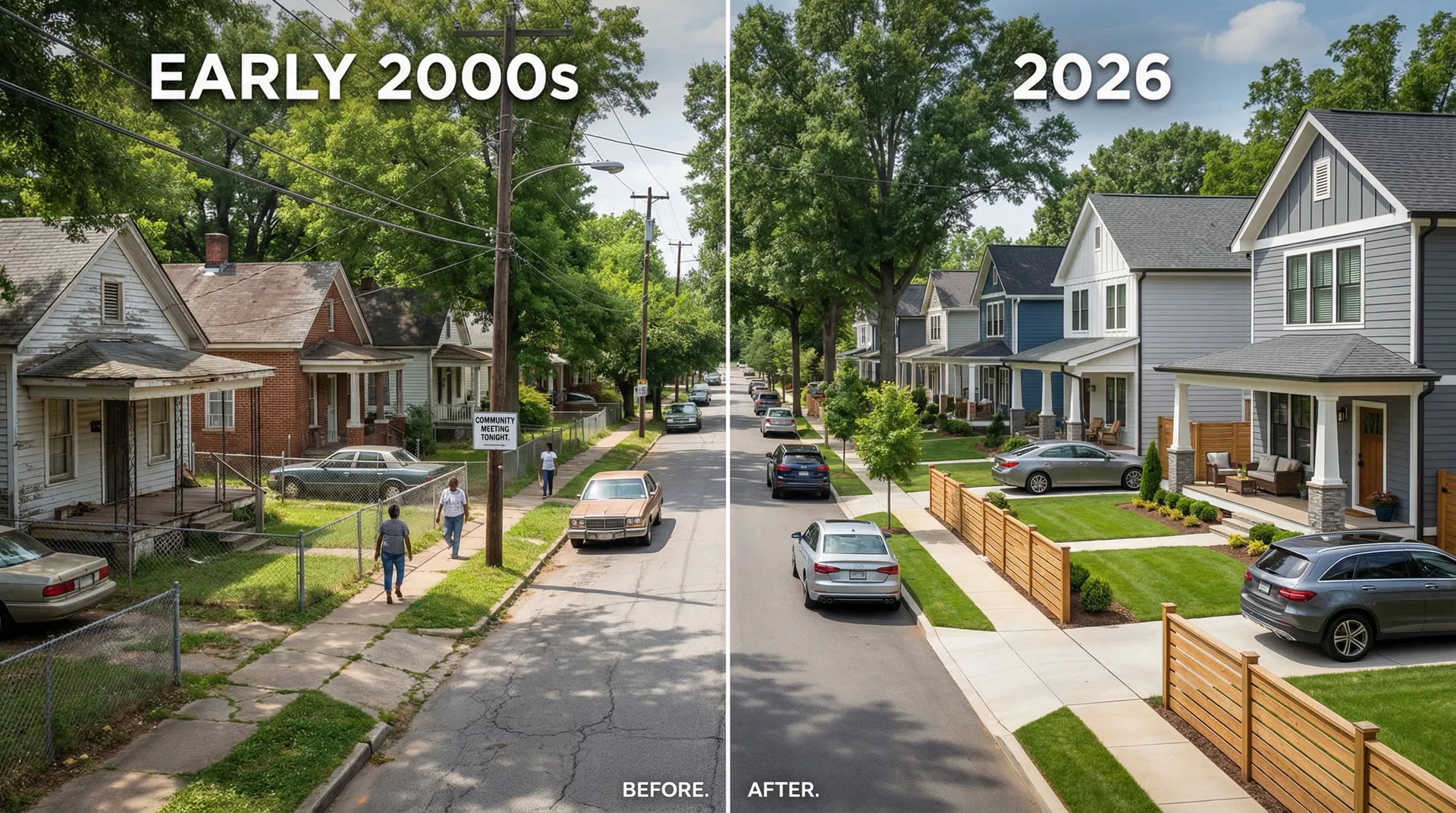
Working-class homes with chain-link fences transformed into modern craftsman renovations with manicured lawns and luxury vehicles
Bankhead (Northwest)
+315% APPRECIATION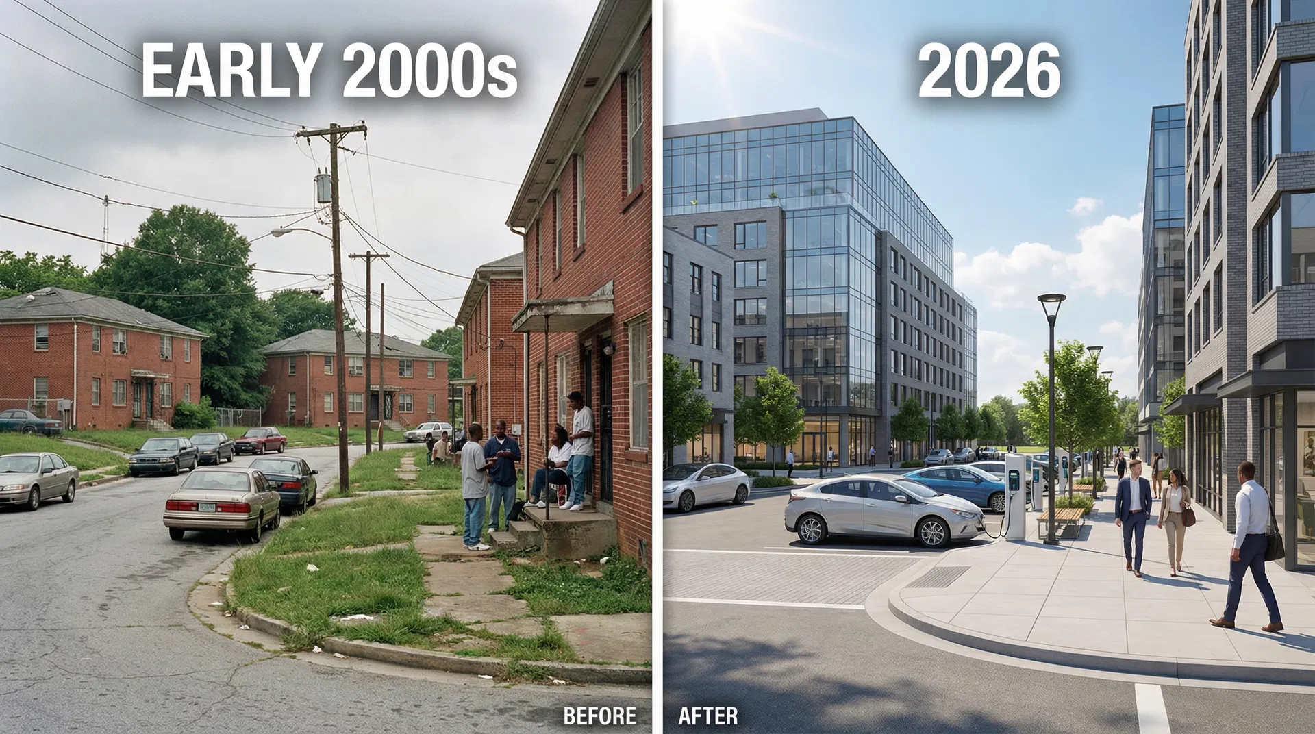
Public housing and older brick apartments replaced by contemporary mixed-income developments with glass facades and upscale amenities
Reynoldstown (Northeast)
+213% APPRECIATION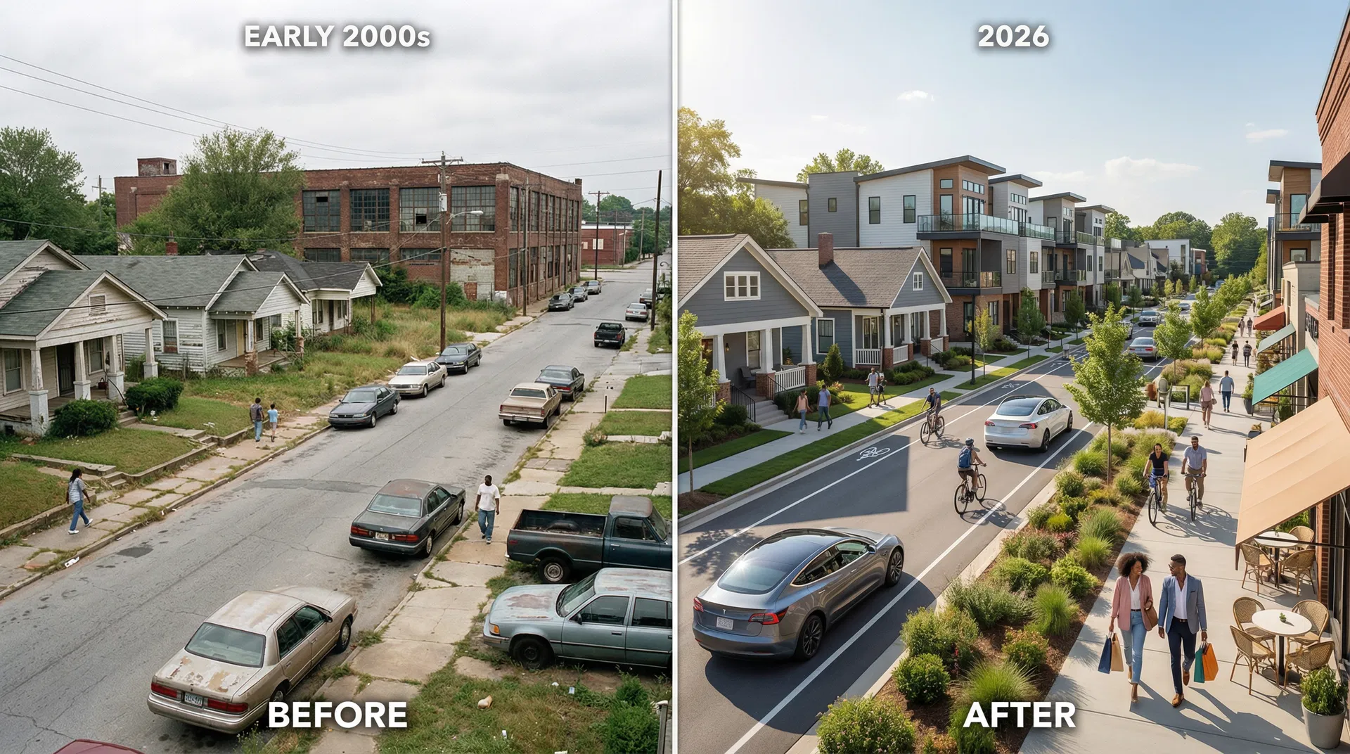
Industrial working-class neighborhood with vacant lots transformed into BeltLine-adjacent townhomes with bike lanes, trendy cafes, and upscale retail
These before/after comparisons illustrate the dramatic physical changes that accompany the property appreciation data. While neighborhoods improve aesthetically, long-time residents are often displaced by rising costs.
THE GEOGRAPHY OF DISPLACEMENT
Key Insights
Southwest Dominance Across All Metrics
The Southwest quadrant is the epicenter of displacement: 12 of the top 20 gentrifying tracts, strong investor activity, and neighborhoods like Mozley Park (+464% appreciation), West End, and Adair Park leading long-term price growth.
Two Distinct Phases of Gentrification
Phase 1 (2000-2012): Northeast neighborhoods like Midtown and Old Fourth Ward gentrified first with steady appreciation.
Phase 2 (2012-2026): moved to the lowest-priced areas: English Avenue (+1040%), Pittsburgh (+785%), and Grove Park (+721%).
Economic Pressure Precedes Demographic Shift
Neighborhoods with the highest price appreciation show moderate demographic changes, while areas with explosive recent growth show the most rapid racial shifts, demonstrating that economic displacement drives demographic change.
The Affordability Crisis is Universal
Rent increases range from +95% to +195% across top neighborhoods, with current average rents between $1,240-$2,580. Even historically affordable areas like West End now price out low-income residents.
Northwest is the Newest Frontier
The Northwest quadrant is intensifying with Grove Park and Bankhead accelerating. These neighborhoods had the lowest baseline prices and now show the fastest percentage growth. These are the current displacement frontiers.
Without intervention, every remaining affordable neighborhood will follow this trajectory.
SEE THE PLAN
Now that you know the crisis, learn how the Neighborhood Reinvestment Initiative and TAD extensions can reverse it.